Delivered as designed
The pixel has been around for many years, so I guess we’re acquainted and know its render behaviour by now, right?
We sometimes change our application settings to view our pixel design in vector, wherein it looks really sharp and fancy. But in the end, it remains a collection of pixels on our screen — regardless our settings. A lot of pixels, shapes, colors and text will make an artboard, combined labeled as “our product”. But is this product actually build as designed?

Our designed product needs to be developed at one point or another, hence the demand of experienced developers. Todays industry focuses on delivering high standard, responsive products with smooth animations and flawless designs. With teamed up disciplines, we work for our selected clients. Either by delivering the best concepts, UX, prototype, design, development, content etc. A guideline for reaching this desired quality, is working nicely together and reviewing our work. The step from final design to interactive product is pretty important, right? That said, this is where I want to give y’all a little heads-up.
When we design, all buttons are nicely alligned to our grid and the line-height of text is chosen with great precision. The icons are centred in circles for a reason and everything is in proportion. Sometimes we even make style guides for our team and client. In the end, we reach a balanced design which we hand over to the developer. When those flows / modules / pages are being developed, it is continuously checked with the design. Nonetheless, things differ in rendering within your browser, compared with either Sketch, XD or Photoshop. Meaning; we can’t always copy-past the font properties or margins, because it just works different in code. Sometimes we even mistype a font-size or color. Oops! — We’re humans after all.
"Sometimes we even mistype a font-size or color. Oops!"
At this point, the final product may differs from its original design. It looks fine in your browser and on your iPhone, but in fact the design is a bit off. When the designer checks the product, he or she could point out several flaws with a trained eagle eye. If we actually 1:1 compare it with the design, both designer and developer might see even more differences.
Remember that we’re in the project together to deliver the best of the best feasible product. So we should improve quality where possible and avoid compare differences. I’m not saying every pixel should be exactly as designed, because there are always render differences due to the browser. More like the text, margins, icons, hover-interaction and colors are “as designed”. We can’t promise our client a design, followed by a product which is not the same. A little side note here is that the design could always change due to e.g. styleguide changes, in that case it’s logic not to 1:1 compare all elements but just those agreed. There will always be edge cases.

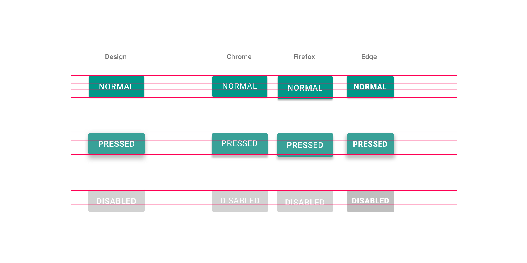
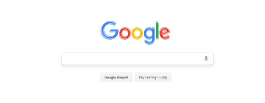
Luckily, we’re living in an era of tools, So off course there’s a tool to easily compare design and development. For example PerfectPixel by WellDoneCode, which is a free Chrome plugin. Please take a minute to install it. The plugin enables you to add an overlay with your exported design to any desired webpage. We can now actually compare our results and tweak flaws where needed. Above I included a comparison example. It’s checked just after developing the first draft and you'll see there are some small flaws. Not saying this looks totally bad, this will actually be a common result. There will be margin- and font-flaws, which we could and should tweak. These little tweaks will result in greater design, consistency and eventually improve overall quality. It all comes down to safeguarding design and assure quality.
"It all comes down to safeguarding design and assure quality."
As said before, working in a team means we need to work side by side. Share your results and polish the project as you go. Don’t wait until the end where you might receive a bulk of feedback. Communicate often, give feedback and finish those small tasks during the general flow. Comparing results influences multiple disciplines and is not ment to blame your team. It’s all about improving quality and raise our standards. When the designer & developer compare results and talk about the product, they’ll both discover room for improvement. The designer might notice things are actually better alligned and more consistent in development. Where development double-checks those line-heights and margins to make sure it’s as designed and balanced.
The more we communicate and learn from each other, the more we improve quality and raise our standards. In the end we always want to make fancy products and be proud!